It’s hard to see a moss for what it really is. As part of an ecosystem, and in art, moss can seem like an afterthought—a sprig of parsley at the edge of an already appealing plate. But moss is so much more than harmless decoration. If we look closely at mosses we can see their diversity and also their beauty. (Continued…)
Decorative Matting for Botanical Art
Quite a few years ago, before I had the opportunity to study botanical illustration, I began collecting botanical prints to be framed as artwork for my home. When I presented the prints to a local framer, they intentionally prepared a decorative mat in the style of English botanical art framing and included bands of marbled paper and colored lines as a method of embellishing the print. At the time, I was unaware that this was a recognized technique for framing botanical art, and it was not until years later that I researched this framing technique.
Using Tinted Graphite to Illustrate Nature
Picking Apples in Geneva
Many botanical artists took note of the beautiful United States Department of Agriculture (USDA) catalog of American fruits and nuts when it was published in 2021 by Atelier Editions. The catalog contains selections from the 7,500 watercolor paintings commissioned by USDA’s Division of Pomology from 1886 to 1942. In addition to apples, which comprise over half of the USDA’s watercolor collection, it contains citrus, berries, melons, and drupes, even nuts, and it illuminated the work of many female artists.
Because my final project in the Wellesley Friends Botanical Program is apples, I bought the book immediately. (Continued…)
Member Spotlight on Faye Van Wert
President's Corner - Meet the New NESBA Board Members
September is a time of many transitions - summer turns to fall, school begins, work replaces vacations - and NESBA held its annual meeting on September 15. The Board of Directors noted our solid financial position, our robust membership of 220, this past year’s programming highlights and the work of the Exhibits Task Force…
Treasures from the Color Archive The historic pigments in the Forbes Collection include the esoteric, the expensive, and the toxic.
How blue can it get? How deep can it be? Some years ago, at the Guggenheim Bilbao, I thought I’d hit on the ultimate blue, displayed on the gallery floor. Yves Klein, who died at thirty-four, was obsessed with purging color of any external associations. Gestural abstraction, he felt, was clotted with sentimental extraneousness. But, in search of chromatic purity, Klein realized that even the purest pigments’ intensity dulled when combined with a binder such as oil, egg, or acrylic. In 1960, he commissioned a synthetic binder that would resist the absorption of light waves, delivering maximum reflectiveness. Until that day in Bilbao, I’d thought Klein a bit of a monomaniacal bore, but Klein International Blue, as he named the pigment—rolled out flat or pimpled, with saturated sponges embedded in the paint surface—turned my eyeballs inside out, rods and cones jiving with joy. This is it, I thought. It can’t get any bluer.
CLICK HERE FOR MORE OF THE STORY :Treasures from the Color Archive: The New Yorker
YOUR ARTIST SIGNATURE by Doris Sheils
Tower Hill Botanic Garden: A Must-See Destination for Botanical Artists
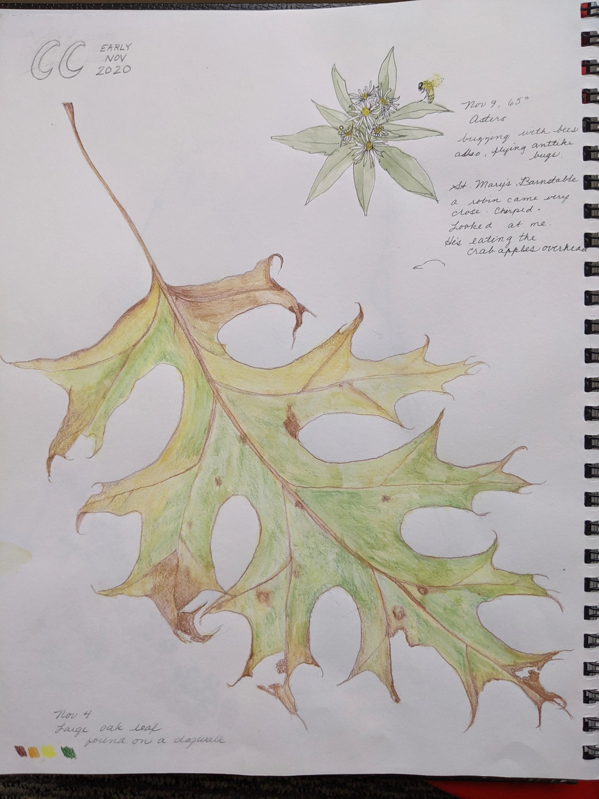
Nature Journaling - Observe and Learn
By Ellen Duarte
Last fall I offered a class at in nature journaling at a local art center. I had only dabbled in journaling in response to my interest in edible wild plants. But when planning to teach a broader perspective, I was delighted at the possibilities. During the six week course, we touched on plants and flowers, trees, birds, and butterflies, and utilized graphite, colored pencil, ink and, of course, watercolor. It is almost overwhelming what can be included in a nature journal, but what a thrill!


